Ultimate Guide to Notion Charts: Features, Examples and Tips
Notion charts are here to transform your Notion databases into clear, insightful visualizations. These charts promise to revolutionize data interaction in your workspace.
From sleek column charts to eye-catching doughnuts, Notion charts will elevate your project tracking, team collaboration, and data analysis. Curious about what Notion charts can do for you? Let's dive into the colorful world of data visualization, Notion-style.
What Are Notion Charts?
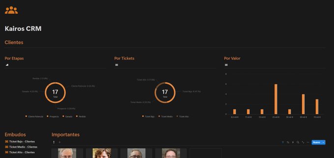
Notion charts are the latest addition to the platform's database view layouts, joining table, gallery, calendar, board, list, and timeline views. This feature transforms your raw data into visually appealing graphics, allowing you to glean insights at a glance.
Unlike other database views in Notion, charts provide a unique way to represent numerical data and trends. They offer a bird's-eye view of your information, making it easier to spot patterns, compare values, and track progress. Whether managing projects, analyzing sales data, or monitoring personal goals, Notion charts help you visualize data in ways tables and lists can't match.
The introduction of charts to Notion marks a significant step toward making the platform a more comprehensive data analysis tool. With four distinct chart types—column, bar, line, and doughnut—users can now choose the most appropriate visualization for their data sets.
What sets Notion charts apart is their seamless integration with existing databases. You don't need to export your data or use external tools. Instead, you create charts directly within your Notion workspace, ensuring your visualizations are always up-to-date.
Types of Notion Charts Available
Notion's new charting feature introduces four distinct chart types, each designed to visualize data in unique ways. Let's explore each type and understand their best uses.
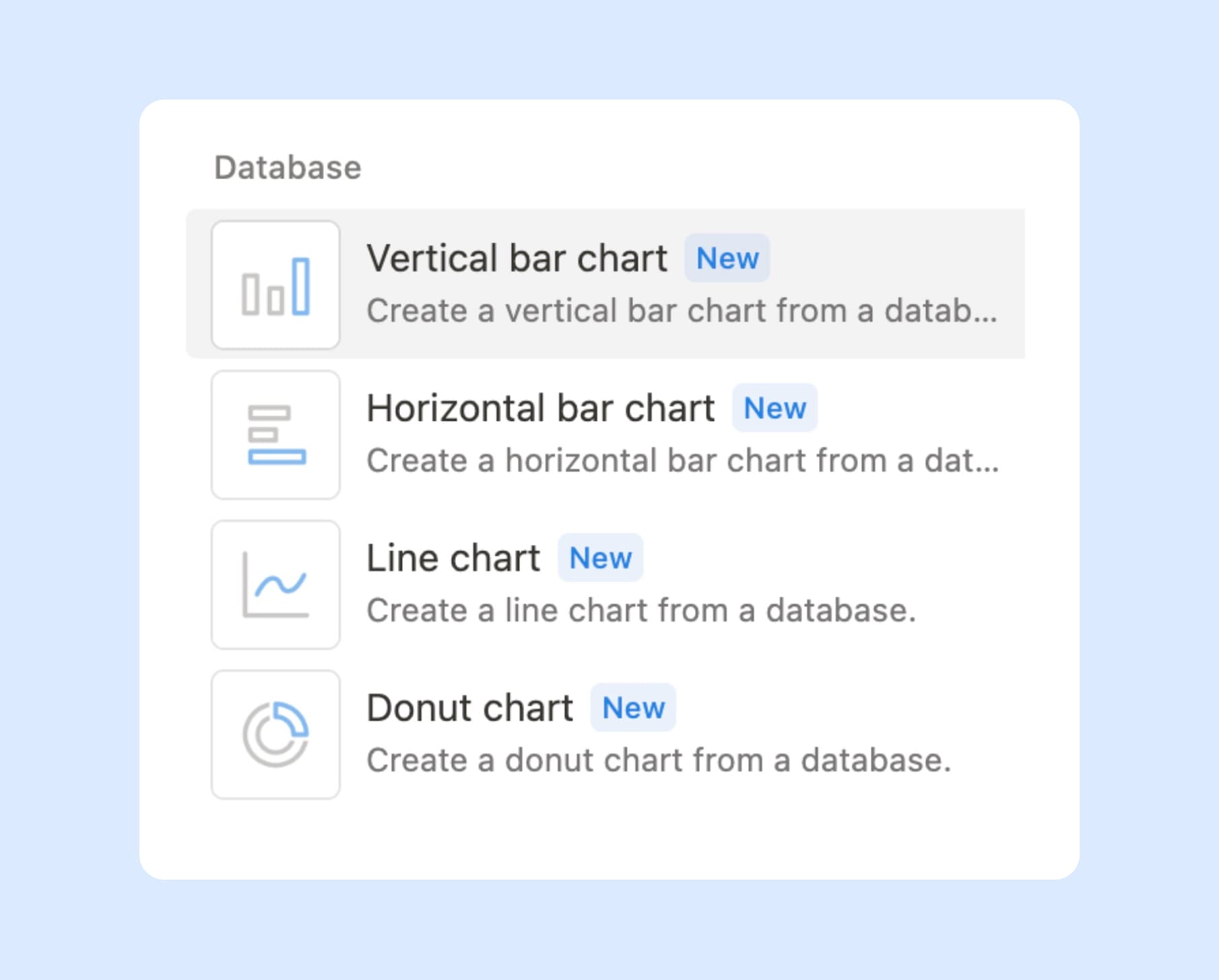
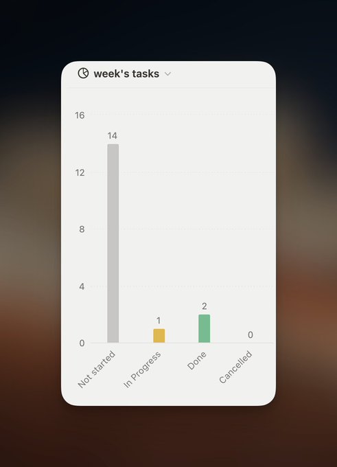
Column Charts
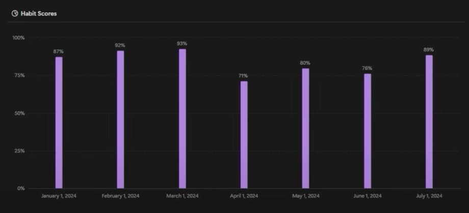
Column charts use vertical bars to represent data. They are ideal for comparing values across different categories. They're particularly effective when you want to:
- Compare sales figures across products
- Visualize monthly revenue over a year
- Show the distribution of tasks among team members
For example, a project manager could use a column chart to display the number of tasks completed by each team member during a sprint. This helps quickly identify top performers and those who might need support.
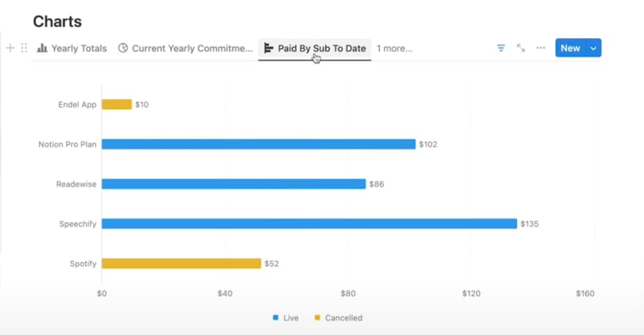
Bar Charts
From BetterCreating
Bar charts are similar to column charts but use horizontal bars instead. They're excellent for:
- Comparing longer category names
- Displaying data with negative values
- Showing progress towards goals
A marketing team might use a bar chart to compare the effectiveness of different advertising channels. The length of each bar would represent the return on investment for each channel.
Line Charts
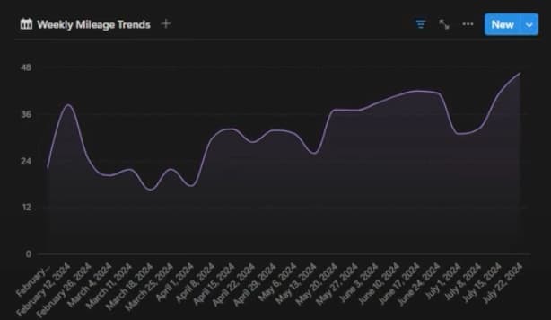
Line charts connect data points with lines, making them perfect for showing trends over time. They're best used for:
- Tracking stock prices
- Monitoring website traffic over time
- Visualizing temperature changes
For instance, a fitness enthusiast could use a line chart to track their daily step count over a month. This helps to easily spot trends in their activity levels.
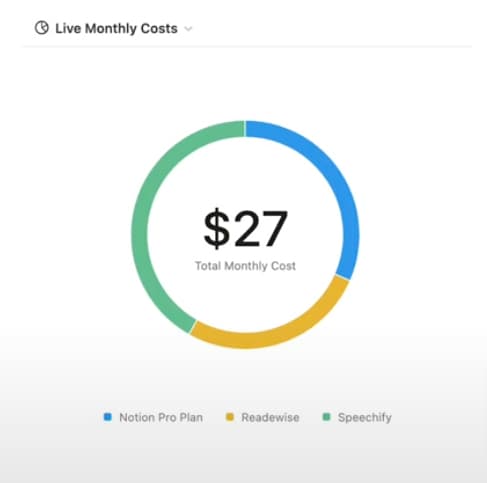
Doughnut Charts
From BetterCreating
Doughnut charts are circular graphs with a hole in the center. They're ideal for showing the composition of a whole. They're great for:
- Displaying budget allocations
- Showing market share
- Illustrating survey results
A small business owner might use a doughnut chart to visualize how their monthly expenses are divided among different categories like rent, salaries, and marketing.
Choosing the Right Chart Type
Selecting the right chart type depends on your data and what you want to communicate:
- Use column or bar charts when comparing values across categories
- Opt for line charts when showing trends over time
- Choose doughnut charts when illustrating parts of a whole
The goal is to make your data easy to understand at a glance. Sometimes, simpler charts are more effective than complex ones. Experiment with different chart types to find the one that best tells your data's story.
Want to supercharge your productivity?
Unlock the full potential of Notion & Obsidian with our plugins.
Customization Options for Notion Charts
Notion charts offer a range of customization options, helping you create visually appealing and informative data visualizations. These options allow you to tailor your charts to your needs and aesthetic preferences.
Color Options
Notion provides three main color schemes for your charts:
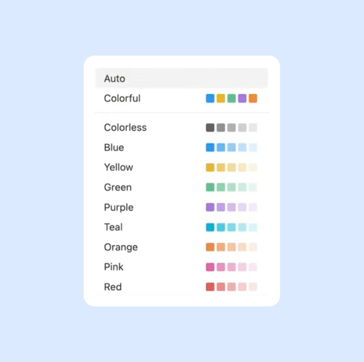
1. Colorful: This option uses a variety of distinct colors, making it ideal for charts with multiple data points or categories. Each element stands out clearly.
-
Colorless: Perfect for a more subdued, professional look, the grayscale option uses various shades of gray. This can be effective for formal presentations or maintaining a consistent, monochromatic aesthetic.
-
One-color tints: This scheme uses different shades of a single color. It's great for creating a cohesive look while still distinguishing different data points.
Choosing the right color scheme impacts the readability and effectiveness of your Notion chart.
Axis Values
Customizing axis values is crucial for meaningful charts. Notion allows you to:
- Decide which values to display on each axis
- Filter data to focus on specific ranges or categories
- Group data by time periods, such as by month or day
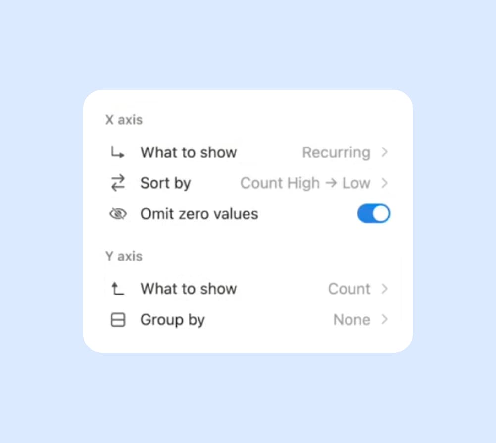
For example, if you're tracking sales data, you could set the x-axis to represent months and the y-axis to show revenue. Filter out low-performing products and group the data by quarter to get a clearer picture of seasonal trends.
How to Create Notion Charts
Creating Notion charts is a straightforward process that enhances your data visualization capabilities. Here's a step-by-step guide:
Adding a Chart
- Open the database you want to visualize.
- Click on the "View" dropdown menu at the top of your database.
- Select "Chart" from the list of available views.
Selecting and Setting Up the Chart Type
- Once in the chart view, click on the "Chart type" dropdown.
- Choose from column, bar, line, or doughnut chart types.
- Select the properties you want to use for your x-axis and y-axis.
Customizing Chart Appearance and Data
- Click on the "Customize" button for additional options.
- Choose your preferred color scheme: colorful, grayscale, or one-color tints.
- Adjust axis values by selecting specific properties or applying filters.
- Group your data by time periods if needed (e.g., by month or day).
Creating effective Notion charts is an iterative process. Experiment with different chart types and customization options to find the best way to represent your data. With practice, you'll be creating insightful visualizations that bring your Notion databases to life.
Want to share fitred database views? We found 6 ways to do it.
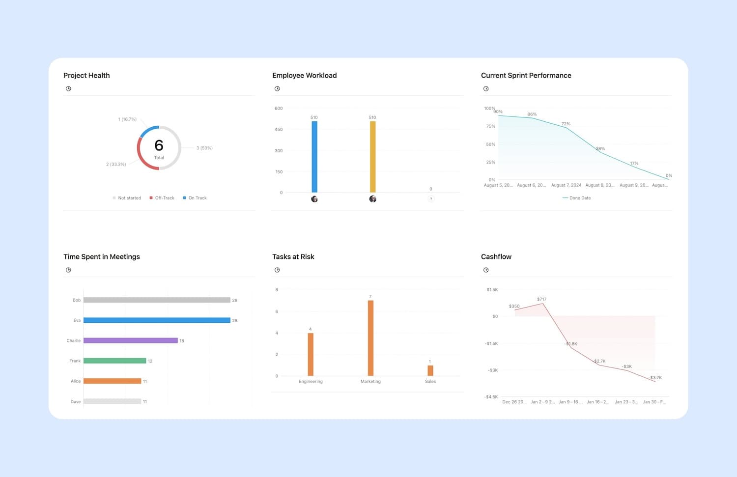
Use Cases for Notion Charts
Notion charts offer versatile applications across various domains. Let's explore some practical use cases that enhance your workflow and decision-making processes.
Personal Project Tracking
For individual users, Notion charts can revolutionize personal project management:
- Use a line chart to track daily word count for writing projects.
- Visualize workout progress with a column chart showing exercises completed over time.
- Create a doughnut chart to represent time allocation across different personal goals.
Team Collaboration
In a collaborative setting, charts can improve communication and project oversight:
- Employ bar charts to compare task completion rates among team members.
- Use line charts to monitor project milestones and deadlines.
- Create doughnut charts to illustrate budget allocation across different project phases.
Business Data Visualization
For businesses, Notion charts can provide valuable insights:
- Visualize sales trends with line charts showing revenue over time.
- Compare product performance using column charts.
- Represent market share with doughnut charts.
Finance Tracking
For personal or business finance management:
- Track expenses with a column chart showing spending across categories.
- Use line charts to monitor investment performance over time.
- Create doughnut charts to represent asset allocation in a portfolio.
Integrating Notion Charts into Workflows
To effectively incorporate Notion charts into your workflow:
- Identify key metrics or data points you want to visualize.
- Choose the most appropriate chart type for your data.
- Regularly update your database to ensure your charts reflect the latest information.
- Use charts with other Notion features like linked databases and relations for comprehensive data analysis.
From r/Typeoneerror
By leveraging Notion charts in these ways, you can gain clearer insights, make data-driven decisions, and communicate complex information more effectively. Whether managing personal tasks, collaborating with a team, or analyzing business data, Notion charts turn raw data into actionable insights.
Want to supercharge your productivity?
Unlock the full potential of Notion & Obsidian with our plugins.
Pricing and Plans
Notion charts are included in the Plus plan, which currently costs $10 per month.
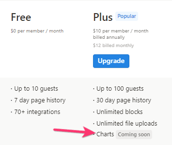
You get 1 free chart per workspace in the Free plan.
Comparison with Other Packages
When compared to standalone data visualization tools, having charts integrated directly into Notion could offer several advantages:
- Seamless integration with existing Notion databases
- No need to export data or switch between different applications
- Real-time updates as your Notion database changes
It's important to note that until Notion officially announces the pricing structure for charts, these are speculative possibilities based on current information.
As we await official confirmation on pricing, it's clear that Notion charts represent a significant leap forward in the platform's capabilities. This new feature promises to transform how users interact with their data, offering powerful visualization tools where the information lives.
Whether tracking personal goals, managing team projects, or analyzing business metrics, Notion charts provide an intuitive way to gain insights and communicate complex data. As Notion continues to evolve, we can expect charts to play a crucial role in making data more accessible and actionable for users across all domains.
Want to supercharge your productivity?
Unlock the full potential of Notion & Obsidian with our plugins.